Building a page list with Goerp
Before creating a website, it may be wise to show a draft of the page layout:
Layout project
If you are working with the application for the first time, you can use the demo source code and see the full version. You can use it or create a new project. To do this, go to the goerp editor and create a new page. Then copy the page source code and save. You are ready to go!
Step 1 - Connect the menu in the base layout
Create a basic layout in the goerp editor and paste the menu top into the body of the template
<div class="menu-container">
  <new-user-menu
          id="main-menu"
          clientCode="{{ .Session.ClientCode }}"
          sessionKey="{{ .Session.SessionKey }}"
          accountLang="eng"
          theme="dark"
          user="{{ .Session.User.FullName }}">
  </new-user-menu>
</div>
Connect also script for menu
Step 2 - Create top navigation
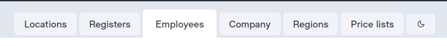
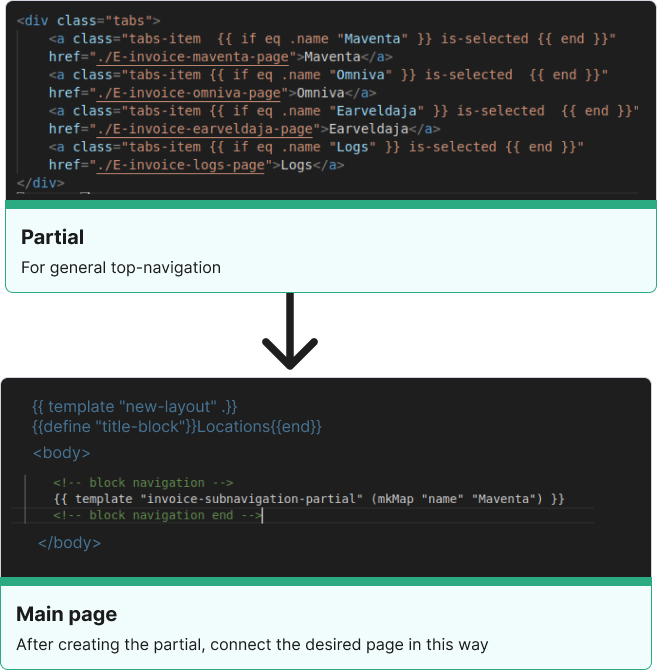
We must wrap the top navigation in a partial so as not to duplicate the code on each page.
This is a Go template code that defines a partial template named "name-partial". The partial template generates a navigation bar that contains three buttons with links, where the button with the name "Name1" is initially active. The navigation bar is generated based on a parameter named "name" passed to the partial template. The template uses Go's built-in functions, such as "eq" to check for equality between the passed "name" parameter and the button name.
The second part of the code calls the "top-navigation-partial" template and passes it a map with the "name" parameter set to "Name1". This means that the generated navigation bar will have the "Name1" button initially active.
{{ define "name-partial" }}
<div id="navigation" class="navigation layout-row-between">
<div class="tab__head">
<div class="layout-row-start">
<a class="button--navigation {{ if eq .name "Name1" }} active {{ end }} "
href="./link">Name</a>
<a class="button--navigation {{ if eq .name "Name" }} active {{ end }}"
href="./link">Name</a>
<a class="button--navigation{{ if eq .name "Name" }} active {{ end }}"
href="./link">Name</a>
</div>
</div>
{{ end }}
{{ template "top-navigation-partial" (mkMap "name" "locations") }}
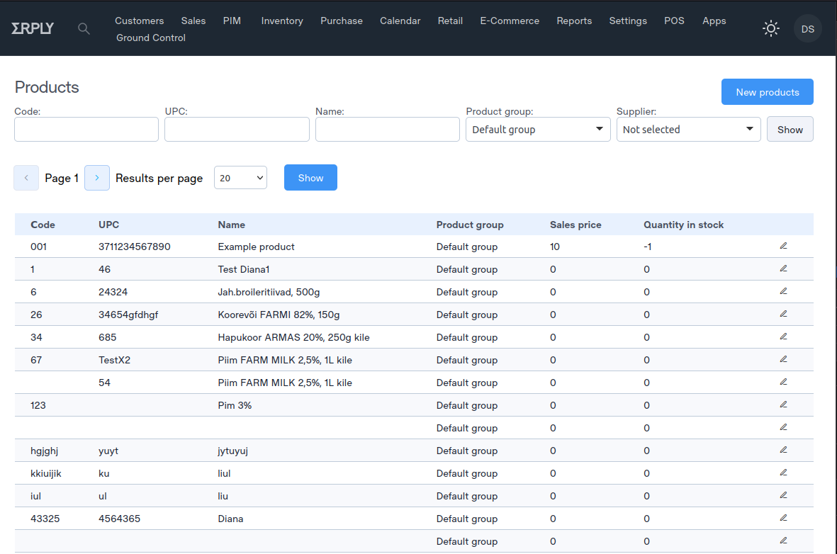
Step 3 - Create header with button

Button for creating a new sheet When this button is clicked, the user goes to the page for creating a new list. This button has the following options:
<div class="layout-row-between">
 <div class="breadcrumbs margin-left-24 margin-top-16">
   <a href="./link-page">
   <span class="text title-main">Main page</span>
   </a>
 </div>
<div class="layout-row-end margin-left-16 margin-right margin-top-32">
   <a class="button button--primary  margin-right"
    href="./list-add-page">New list</a>
</div>
Step 4 - Create filter form

Search Form
The form element with the method="get" attribute represents a form for submitting a request to the server. This form has the following options: method: The method to submit the form to the server.Input fields
Input elements with type="text" attributes represent input fields for searching data. Each field has its own id, name and value.Form submit button
The button element with the attribute type="submit" represents a button to submit the form to the server. This button has the following options: class: Classes for styling the button. id: button id. type: button type.The generic container with the class row contains the input fields and the submit button of the form. Each input field is placed in a container with a col class. A container with a margin-left class sets the padding to the left, and a container with a margin-right class sets the padding to the right. The form submit button is placed in a container with a col class and a margin-top-16 class to set the vertical top padding and a margin-right-32 class to set the horizontal right padding.
{{ define "filters-partial" }}
<!-- block filter -->
<form method="get">
<div class="row">
<div class="col margin-right-8">
<label for="Form">Form:</label>
<div class="input input-fullWidth">
<input type="text" id="id" name="filter.form"
value="{{ .Data }}">
</div>
</div>
<button type="submit" class="button--small button--navigation--outlined margin-top-16 margin-right-32"
id="search">Show</button>
</div>
</div>
{{ end }}
Step 5 - Create pagination
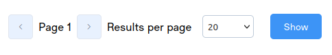
<!-- pagination -->
<input type="hidden" name="Preset.DataQuery.RecordsOnPage" value="20">
//This is the display of the number of entries per page by default, which is 20.
<input type="hidden" name="Preset.DataQuery.PageNo" value="1">
//It displays the default page number as 1.
<form method="get" id="table-form" data-pagination>
//This is a form submission wrapping table and pagination elements.
<div class="pagination aligner aligner--contentStart aligner--centerVertical">
//This is the container element for the pagination buttons and dropdown menu.
<button class="button--icon button--outlined icon-Chevron-Left"
id="previous-button"></button>
//This is the button to go to the previous page.
<input type="hidden" name="DataQuery..PageNo"
<p class="aligner aligner--centerVertical">
Page {{ .Data.DataQuery.PageNo }} </p>
<button class="button--icon button--outlined icon-Chevron-Right"
id="next-button"></button>
<p class="aligner aligner--centerVertical">Results per page</p>
//This is the label for the dropdown menu.
<select class="select margin-left-16 aligner aligner--centerVertical"
name="DataQuery.RecordsOnPage" id="select">
{{if eq "20" $.Data.DataQuery.RecordsOnPage}}selected{{end}}>20</option>
//This is a drop-down menu for selecting the number of records to display per page.
<option value="20"
</select>
<button id="show" class="button button--primary">Show</button>
//This is a button to update the table to show the selected number of records per page.
</div>
<input type="hidden" name="postAction" id="table-action">
<input type="hidden" name="postActionEntity" id="table-entity">
<input type="hidden" name="postActionIds" id="table-selected-rows">
<input type="hidden" name="DataQuery.RecordsOnPage"
value="{{.Data.DataQuery.RecordsOnPage}} ">
<!-- pagination end-->
Step 6 - Create table list
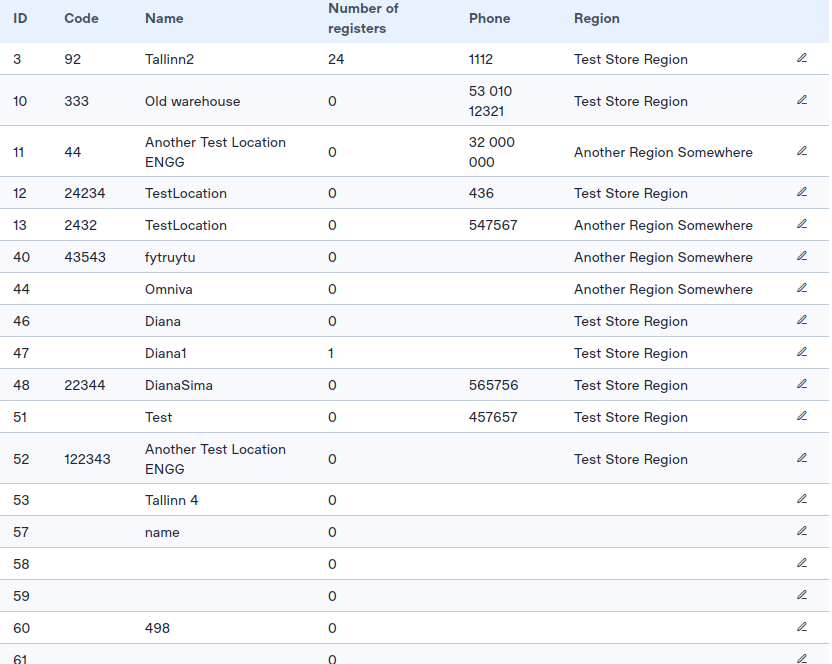
which are used to send data to the server. A table with a header row and multiple rows of data.
block that iterates through each sheet in the DataDtoList and creates a table row for each one. Each row of the table contains data for the columns as well as an edit button for each row. The edit button leads to another page with the AccountAdminApi.DataInput.ID parameter set to the appropriate ID .
<div class="flex-block-table">
<input type="hidden" name="postAction" id="table-action">
<input type="hidden" name="postActionEntity" id="table-entity">
<input type="hidden" name="postActionIds" id="table-selected-rows">

<table class="table" id="table">
    <thead>
        <tr class="text-left">
            <th>Data1</th>
            <th>Data2</th>
        </tr>
    </thead>

{{ range .Data.DataAdminApi.DataDtoList }}
        <tr class="row-table" class="margin-left-16">
        <td class="numeric"  data-title="Data1">
        {{ .Data1 }}
        </td>

        <td class="numeric" data-title="Data2">
        {{ .Data2 }}
        </td>

        <!-- table icons -->
        <td class="cell-icon" data-title="">
        <a href="/{{ $.Session.ClientCode }}/{{ $.Session.Language.Code }}
        /data-add-page?Data.DataAdminApi.DataDtoList.ID={{ .ID }}"
        target="_self" class="table-action-button">
        <i class="button button--transparent icon-Edit-Line"></i>
        </a>
        </td>
        </tr>
    {{ end }}
    </tbody>
</table>
</div>